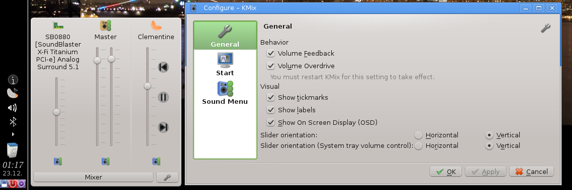
The new Configuration dialog (right). The Sound Menu (left) reflects the selected controls, and also shows the new “Pause” icon, as Clementine is currently playing and can be paused.
I took a small vacation from work to research relocation possibilities. While I was home I also spent time on completing the announced configuration dialog update and for updating the Sound Menu. KMix is more responsive, playback changes being reflected by KMix. Thanks to the communication infrastructure established done during the Multimedia Sprint 2012 in Randa it was easy to keep KMix consistent. Additionally I refactored the code for future additions like showing album picture.
- Media Player playback status is reflected by Sound Menu. Shows
 or
or  .
. - Configuration dialog overhaul; Options are grouped in tabs and the apply button is responsive.
- Configuration of the Sound Menu has been integrated in the configuration dialog as separate tab
- Volume Overdrive up to 150% now officially supported for PulseAudio due to popular request.
- Less CPU usage and latency for MPRIS2.
- Sound Menu position optimized for all 4 panel positions (Bottom, Left, Top, Right)
The end of year 2013 is nearing. We will all see an exciting Year 2014 with Plasma 2 waiting in the wings.
See you all there,
Christian
Technical stuff
If you are interested in the source code changes, http://quickgit.kde.org/?p=kmix.git&a=commit&h=0f7a603e1d327f76dbd6a62d08315b1956794d42 is the biggest commit, and it also contains references to features and bugs. For the technical interested: It is based on KConfigDialog and KConfigSkeleton [1], which is a very cool technology I discovered recently. If you do not know KConfigDialog and KConfigSkeleton, here is a short overview:
KConfigSkeleton + KConfigDialog
- KConfigSkeleton links configuration entries from a property file with variables (e.g. a QString)
- There are methods to copy from property file to configuration variables and vice versa
- KConfigDialog can use a KConfigSkeleton, to prefill e.g. a related QCheckBox
- KDE Techbase recommends KConfigXT. But KMix is a fine example without.

Posted by Shantanu Tushar Jha on December 23, 2013 at 5:51 am
Cool, time to implement MPRIS2 in PMC 😀
Posted by chungalitos on December 23, 2013 at 8:20 am
Don’t you think a horizontal layout for the sound menu would be cleaner? The current one can be complete, full-featured… but it’s pretty messy.
A couple of examples:
Posted by beylix on December 23, 2013 at 8:21 pm
Please take another look at the screenshot (or former posts with screenshots): You can configure it.
Posted by KDEUSER56 on December 23, 2013 at 10:07 am
Are there any (of course optional) enhancements in terms of pulse audio planned? (like it is available in veromix: http://kde-look.org/content/show.php?content=116676)
Especially nice would be the possibility of a equalizer and the possibility to redirect stuff easily (for example: redirect output additionally to the microphone input etc.)
Thank you for the great work!
Posted by beylix on December 23, 2013 at 8:19 pm
Not from me, as I do not use PulseAudio. And as there is no active developer for KMix PulseAudio, this is not likely. Moving streams to another device is supported, though (right-click/ context menu).
Posted by KDEUSER56 on December 23, 2013 at 8:38 pm
But it seems moving output streams to input is not supported (at least there is no option for that here). (My input device works fine though).
Are you planning to support moving output to input in the future?
Would it be possible to hear the output of a program and simultaneously using the stream for the input along with my voice?
(Real world usage example: You are having a video conference and want to share the audio you are listening to with other people, but being able to comment on it at the same time.)
Posted by beylix on December 24, 2013 at 11:55 am
Moving output streams to input: I have no idea whether or how this can be done. If it is a PulseAudio feature, it would require a maintainer, as there is no active maintainer for the KMix PulseAudio support any more.
Posted by KDEUSER56 on December 24, 2013 at 2:14 pm
Regarding your comment on December 24, 2013 at 11:55 am:
Yeah that is a pulse audio feature to my knowledge. It can be done by the veromix plasmoid.
Could you point me to the source of KMix PulseAudio?
Would additional features regarding PulseAudio be welcome?
Merry Christmas and thank you for the great work!
Posted by beylix on December 28, 2013 at 1:23 pm
Thanks for your feedback. I am not sure why your comment was approved without me replying. So I am doing this now:
KMix can be found in https://projects.kde.org/projects/kde/kdemultimedia/kmix/repository . Primary source for PulseAudio support is backends/mixer_pulse.cpp. Additonal features are very welcome. It is also OK if changes to the KMix core are needed, actually I would expect that. Please contact me if you are interested.
Posted by KDEUSER56 on December 27, 2013 at 12:44 pm
Somehow a got a notification my question has been answered but I cannot see any answer 😦
Posted by fasd on December 23, 2013 at 10:36 am
Those are one big ass ugly icons…
Posted by beylix on December 23, 2013 at 8:26 pm
Apart from the fact that your reply is highly counter-productive, I am sorry to hear you dislike the Oxygen Icon theme. But you are aware, that you can change your icon theme, aren’t you?!? *shrug*
Posted by Bugitus on December 23, 2013 at 11:06 am
Please, make volume sliders same size, the screenshot looks so ugly with different size sliders. Maybe shorter names (titles) for sliders and show full names when hovering with mouse?
Posted by beylix on December 23, 2013 at 8:20 pm
See my reply to the other comment.
Posted by onety-three on December 23, 2013 at 11:30 am
Thank you for your work on one of our most essential applications!
Posted by Hans on December 23, 2013 at 2:27 pm
How to install this version on Kubuntu 13.10 ?
Posted by beylix on December 23, 2013 at 8:17 pm
This is a development version. It is not shipped. You could check whether your distribution provides “trunk” KDE builds – I read that Ubuntu did for some time and probably still does. Or wait for the next stable KDE version.
Posted by Hans on January 2, 2014 at 11:22 am
OK. Thanks
Posted by Saabzero on December 23, 2013 at 2:39 pm
This looks quite awesome already. I am looking forward to testing it!
I read about a GSoC2013 project to integrate a KDE sound menu widget similar to the audio dialog in ubuntu. Has there been any progress made in this regard?
Thanks for the update 🙂
Posted by Robert B on December 23, 2013 at 2:42 pm
Why the hell do we need prev/pause/next icons in a audio mixer?! Thats insane.
Posted by beylix on December 23, 2013 at 8:10 pm
Of which *we* are you the hell talking about. Are you two persons? Many people use and like it. Thanks for your “constructive” feedback, by the way. 😐
Posted by Richard on December 23, 2013 at 7:33 pm
Putting the control buttons vertical is quite unusal and it doesn’t look so nice…
Wouldn’t it be better to place them horizontally direct below the sound source text, ie. Clementine here?
Another thing which I strongly dislike is the uneven heigth of the sound bars. IMHO the text schould be trimmed after two lines (you could still see the full text when hovering), this is also what everyone is used to from there filemanagers…
Posted by beylix on December 23, 2013 at 8:14 pm
Alternative: You can configure the sliders to be horizontal, as seen in the config dialog. Below the source takes way too much space. Uneven height is usually only a problem for PulseAudio, as it has insane long names. I do not care so much, as Ido not use PulseAudio – but if someone steps in with a patch, I will gladly integrate it.
Posted by Richard on December 28, 2013 at 6:51 pm
Hello, first of all: Thank you for the work! I forgot that in my first post, also I just checked my Kmix and saw how much improvement you did. 🙂
Regarding your response:
Well and what if I don’t like horizontal sliders? 😉
Maybe the control buttons could be placed on the same line with the mute button? This would fit thematic, but also space wise.
Judging from you screenshot you also have a needlessly long name/ description for your soundcard. Patch? uhmm, not yet…
Posted by beylix on January 2, 2014 at 6:14 am
Posted by Zoidberg on December 25, 2013 at 4:04 am
Nice work in the technical side, but it is not aesthetic (vertical or horizontal, but more vertical).
Why not search some advice from the KDE (or others) Human Interface Guidelines folks?
Programmers are commonly bad designers, and designers are bad programmers.
Posted by Mark on December 26, 2013 at 8:50 pm
Hi,
On a technical point of view you’ve done an amazing job! Nice and very much welcomed improvements. Thank you very much for that!
But as you could have guessed, there is going to be some criticism from me 🙂
1. The “Slider Orientation (System tray volume control):”. Just drop that. Just have one slider orientation setting that applies to all sliders. This special system tray setting seems to make the UI a bit clogged there. You could leave it in as a hidden setting with no visual representation in the UI.
2. The control buttons for Clementine. It’s truly is wonderful that it’s technically possible! However, it just doesn’t fit in this design. The icons look way out of place (yes, i can change icons.. not a valid argument. The _default_ ones look out of place). and a top – bottom navigation for controls really doesn’t look appealing to me. I’d recommend just dropping that if the sliders are in a vertical orientation. You might want to show them when the sliders are horizontally displayed, but even then you’d have to orientate the button horizontally as well.
3. Mute icons
Ehh, i guess those are your icons and not plasma defaults? Anyway, they – as they are in the screenshot – are looking out of place as well. The top icons (above the sliders) do look nice though.
I hope you can do something with it.
Cheers,
Mark
Posted by beylix on December 27, 2013 at 12:41 pm
Thanks for your detailed feedback, Mark. I’d like to comment on it:
> 1. The “Slider Orientation (System tray volume control):”. Just drop that.
Not sure whether I can do that. If one moves the panel to the left, the layout sometimes look more pleasant when changing the orientation. It depends a lot on the number of controls and personal taste. I would rather optimize the layout, or move the “tray orientation” to the “Sound Menu” tab.
> 2. The icons look way out of place ([…] The _default_ ones look out of place).
Well, those are *the* application icons – there are no other ones, and they are even used by the applications like Clementine themseves. I do not find them out of place, so it is possibly just personal taste.
> and a top – bottom navigation for controls really doesn’t look appealing to me. I’d recommend just dropping that if the sliders are in a vertical orientation.
I don’t think I want to limit functionality simply because the current layout is suboptimal. There must be a more clever approach for the design, like putting the icons closer together or adding a border frame.
> 3. I guess those are your icons and not plasma defaults? Anyway, they – as they are in the screenshot – are looking out of place as well.
Good point. Those icons have been painted by the KDE artist team ages ago, so I have stopped thinking about it. I might change them to use standard icons (audio-volume-muted and audio-volume-high/medium/low).
Posted by Zoidberg on December 28, 2013 at 10:27 pm
Of course colors, taste, etc. is a personal opinion, and KDE allows to customize many aspects of the desktop, but defaults are very important, and IMHO, they should be set to what is the most easy-to-use and minimalist (not the config options) for the majority of users.
Look at Mac OS, or iOS, it is extremely simple to use for almost every one, but lacks many options. If all programs *defaults* could be à la Mac OS, then it would be a big win. The average user would be happy, and the rest could continue customizing. That is way I suggest that a (KDE) HIG expert assist you with the graphic design. The technical part, as many have already told you, is wonderful.
Posted by KDEUSER56 on December 28, 2013 at 11:21 pm
@zoidberg and others who complain about the UI-stuff: I think the UI might change with KF5, as there has already been made an approach of a qml-port: https://git.reviewboard.kde.org/r/112208/
In my opinion the current UI is very nice, I do not think Christian needs to consult with a HIG-expert.
Complaining or stating that people should consult with “experts” is not very helpful.
Think about what could be done better and try to make a detailed mockup, as this could really be helpful, or at least allow a sensible discussion.
Pointing out that other platforms do it better in your opinion does not help either, as they often are in a complete different situation or do not provide so many functions and hiding everything for a cleaner look may harm usability.
@beylix Are you okay with the efforts of porting the applet to qml to better fit plasma (as Klipper and all other systray elements so far have also been ported to qml in KF5)?
Thank you btw. for all your quick responses. I plan to have a look at the pulse audio specific functions as soon as I have got more time.
Posted by KDEUSER56 on December 30, 2013 at 12:01 pm
Correction: I want to clarify that I did not mean KDE Frameworks 5 but Plasma 2 here: “(as Klipper and all other systray elements so far have also been ported to qml in KF5)?”